Welcome to the Let’s Explore series, where we explore a notable place from an urban design perspective, seeing how its layout and design influences the experience of being there.
Patricia’s Green is a public space in San Francisco’s Hayes Valley neighborhood, close to downtown. It’s a park rich in activity. Friends sit on benches, eating ice cream and enjoying the view; others stroll leisurely down the nearby narrow alleys; one local even brings his parrot to entertain the kids. People of all kinds, at all times, make this a thriving social environment.
I’ve spent many hours enjoying Patricia’s Green and watching the world go by. Over those hours, I’ve noticed how much the park’s excellent design make this a superb spot to sit, stroll, play, and socialize. So this is the perfect place for a Let’s Explore.
Patricia’s Green Overview
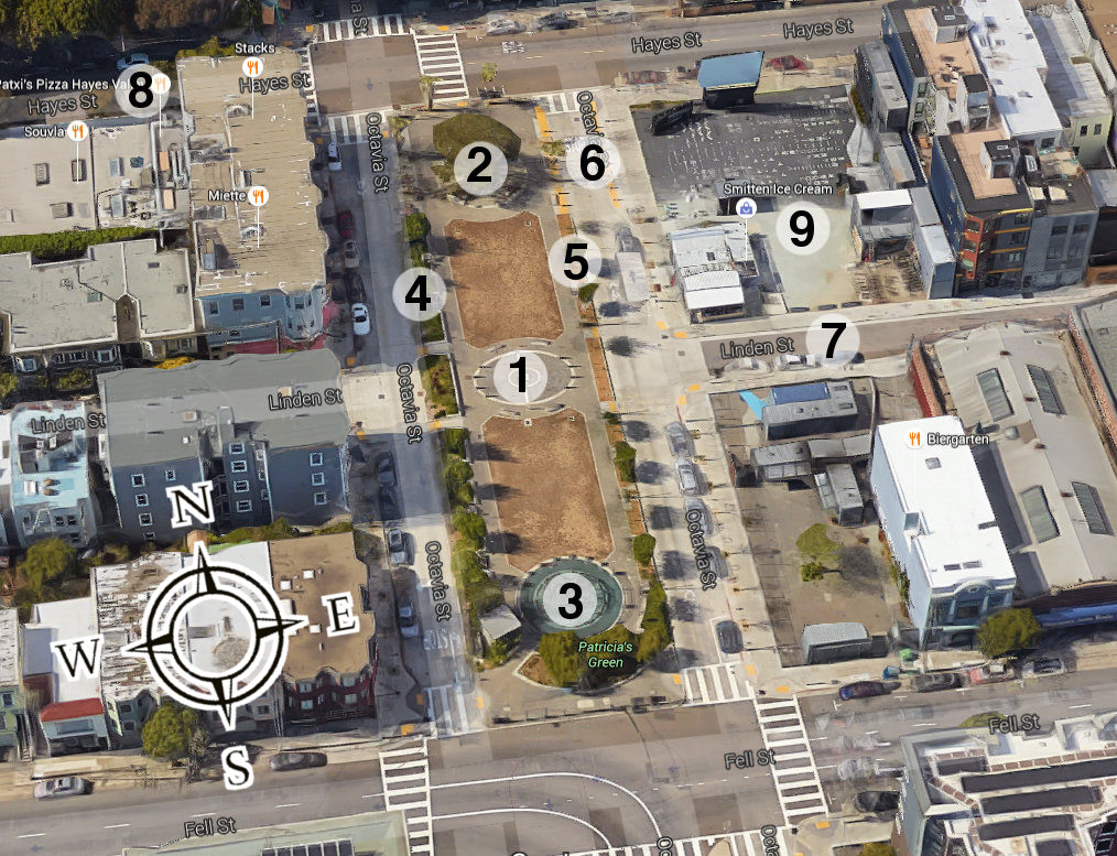
| 1. Central installation 2. Tree and circular social area . 3. Children’s play area 4. Benches and low walls |
5. Backless benches and no walls 6. Narrow street with no curb 7. Narrow alley 8. Commercial street 9. Proxy area |
In today’s Let’s Explore, we’ll walk around Patricia’s Green and see what makes it a great public space…
A. Modest in size
Standing next to the central installation (1) (the wooden temple in these photos has since been removed), we look north toward the circular seating area (2) and south toward the children’s play area (3).
The park is modestly-sized: 290 feet long by 70 feet wide. Distances of up to 80 feet are generally seen as being within the human “social field of vision” where individual characteristics and body language can be discerned. This means that standing under the central installation (1), much of the park falls within the social field.
Modest size also means that a small number of people are required to make a space feel lively. Indeed, just 40 people are enough to make Patricia’s Green feel alive.
B. There are many places to sit
From the circular seating area (2) looking south, notice how much seating there is. Along the park’s east side is a line of backless benches (left photo above). Along the west side (right photo) are benches with backs, fewer in number than the backless benches on the other side. However, the low wall upon which the guitarist sits can become seating if the benches fill up. Great public spaces keep people around by offering plenty of places to sit. Patricia’s Green certainly does this.
Notice how the eastern side has no low walls. This makes it easier to move between the adjoining destinations and the park.
C. The park is divided into three areas
Patricia’s Green is divided into three areas: The center installation (1), the circular seating area (2) at the north end, and the children’s play area (3) at the south end. These areas break the park up into smaller pieces, making each part more intimate. (1) and (2) also visually cap the park, creating a sense of refuge from the vehicular streets beyond.
D. Many destinations surround the park
Standing near the circular seating area (2), see how a variety of businesses surround the park’s northern half. Going clockwise through the above photos: The main part of the Hayes Street commercial strip (8) (to the north-west); the continuation of Hayes Street (to the north); a seating area with a juice bar, food truck, coffee dispensary, and bicycle rental/tour shop (9) (to the east); an ice cream shop (to the south-east); and a beer garden (further south-east).
This variety of surrounding destinations are “active edges” that provide many reasons for people to sit in or to cross the park, keeping it lively.
E. It’s easy to move in and out of the park
In addition to the lack of a wall along the park’s eastern edge (see part B above), the side street (6) (left photo) on the east (and west) side and the nearby Linden Alley (7) (right photo) are narrow, just 20 feet wide. These features make it easier to move in and out of the park across to surrounding areas, increasing the likelihood of people using the park.
These narrow street widths make these streets calmer and inherently pedestrian-friendly. No signs are required to tell people to walk there, the street width makes it obvious. Automobiles can still use these streets but they go slowly, making the environment a more democratic place where people, bikes, and cars are more equal.
F. The area embraces gradual changes
The Proxy company owns the area (9) to the park’s south. Unlike most developments which implement one large inflexible plan, this area sees experimentation and gradual changes. More recently, a red planter/seat and a large movie screen have been added (left photo). And a hot dog vendor (right photo) has set up in Linden Alley (7) on the weekends. Thus, the park’s edges have become even more “active” and the park therefore even livelier.
A Place Worth Caring About
Since its creation in the early 2000s, Patricia’s Green has transformed the Hayes Valley neighborhood. There are familiar faces everywhere, friends and neighbors meet here, and business employees regularly help each other out. Even the area’s homeless individuals are also known, and are shown kindness, by the community.
As we’ve said before, happy and healthy people need centrally-located car-free public spaces such as Patricia’s Green. Pay the park a visit if you’re ever in the area.

