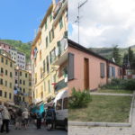
Great commercial buildings benefit everybody,
not just shoppers
As a child, my favorite place to go was Guernsey’s commercial High Street. As an adult, I fell in love with somewhere just as good: the Pearl Street Mall in Boulder, Colorado. People are drawn to lively places. We love to attend to our daily needs around other people and to check each other out, whether it be children playing, busking musicians, or promenading older folks.
Great cities revolve around great commercial areas, whether they’re pedestrian only (the best areas) or regular arterial streets. These are the places where people go for their daily needs and to socialize. A city must take great care with its commercial places. Every commercial building must be done right.
How to design a great commercial building
How NOT to design a commercial building
Before visiting more great commercial buildings we’ll visit the dark side. And thanks to today’s developers, who are regularly hitting new lows, we don’t have to go far. There are plenty of examples here in Austin…
This building on East 6th Street in Austin hasn’t even fully opened yet and it’s already a failure. Shop entrances are half hidden, windows are opaque, and there’s no differentiation in storefront styles. At least people live upstairs and storefronts are packed together. Forget the rest. A trendy name (“The Arnold”) and website won’t save this train wreck.
The other side of the building is even worse:
You can barely tell this is ground floor commercial space. With a huge set back and pointless obstructive landscaping, which ruins the connection between the building and the street, this is commercial design at its worst. We should pity the businesses moving in here.
Let’s explore some more commercial architecture write-offs…
Any half-decent architect knows how to make a building’s entrance obvious. I circled this dental practice twice before discovering the entrance. I reasonably assumed the entrance would be the door closest to the street under the eye-catching blue awning but instead it’s located behind a row of parked cars. With its large set back and hidden entrance, this building severs its connection to, and rejects, the street as the foundation of public life.
When a commercial building is this far back from the street all chance of passersby noticing it is eliminated. This looks like a house (which it almost certainly is/was) rather than a commercial building, further diminishing its chances of standing out. Here, the bridal lounge’s owners have tried to compensate for all this with a sign, which is a poor replacement for an appropriately-designed and positioned building.
For a long time, there was a clear set of traditional design principles that helped people instantly know a building’s purpose – houses looked like houses, civic buildings looked like civic buildings, and commercial buildings looked like commercial buildings. The above building is worrying because it suggests we are losing this basic set of shared design principles, leading to a more confusing and less character-rich environment.
This pitiful building embodies all the mistakes made in the other buildings above: Poor use of styling to denote its commercial nature (is this an office building or…?), a weak connection to the street, little differentiation between commercial lots, and poorly discerned entrances. Particularly comical is the a-frame sign on the right, which is needed because the entrance to the eye physician is so badly located. Signage like this is a common measure to address poor building design.
We should all be concerned that so many new developers and city building departments demonstrate a lack of basic time-honored understanding of commercial building design. Citizens and business-owners depend on such design to help people notice and locate businesses and to generate lively, safe, economically-strong cities.
Fredericksburg shows how to do it
As we saw earlier, the basic principles behind good commercial building design are few and simple – but there are infinite ways to manifest these principles. Austinites slapping their foreheads at the above travesties can take a trip to the nearby Texan town of Fredericksburg, whose main street is chock full of superb commercial architecture. Almost every building embraces the simple design principles of good commercial architecture and manifests those principles in many different was. Let’s take a visit.
This time, we’ll leave the photos annotation-free. Have a go at identifying the design features and then we’ll discuss some of them under each photo.
This handsome storefront features large windows for showing off goods, a slightly recessed door and shorter windows for emphasizing the entrance, and detailing and a color scheme that differentiates this store from its neighbors. And like all the examples we’ll explore in Fredericksburg, the building comes right up to the sidewalk and connects to the neighboring buildings.
While this building still meets the sidewalk, the entrance is more recessed, providing more surface area to show off wares before someone enters the store. Notice how the recess is tapered, increasing the range of angles at which a passerby can see goods in the windows.
This unusual building actually allows people to walk among goods on sale before even stepping into the store.
Looking closer, we see the level of detail and character on many of Fredericksburg’s commercial buildings. This detail adds charm and character. It also visually unifies the buildings and provides a pleasant flow as one walks down the street, avoiding the unsettling effect resulting from a mishmash of building styles.
Now we’re moving beyond the buildings themselves, which is important since the best commercial buildings must transition gracefully into the public realm to attract the most people inside. This building extends a gallery over the sidewalk which, together with chairs and tables, creates an outdoor room effect, encouraging people to stick around, which in turn attracts other people.
This stretch of buildings also provide a gallery over the sidewalk, which is valuable during those sizzling hot Texan summer days. Public benches on the sidewalk, a common sight in Fredericksburg, encourage lingering and maximize people-presence, a powerful way to attract people to the area. It all adds up to a wonderful bustling social environment.
So inviting and well-defined is this space, it’s easy to forget the wide highway on which Fredericksburg’s main street is located. If the town ever wanted to secure this area as a true world class destination, it could consider the infill approach.
So much superb commercial architecture with the knock-on effects of liveliness makes this street a big draw for people from many miles around. Notice the range of human activity in the below photos. This is a place to visit, whether or not you buy anything.
There’s no excuse for bad commercial architecture
We’re still capable of quality commercial architecture. The above photos of The Domain, a recent large scale subdivision development in Austin, show that modern developers can create good commercial buildings. Let’s remember that The Domain (which I admit is far, far from perfect) was built in the same city that approved the dismal buildings across town we looked at earlier.
The public should demand good design in all new commercial buildings. And the responsibility for ensuring this good design falls squarely on the shoulders of local building departments. Who approved the new lackluster commercial buildings in Austin? We can and must expect better in the future.
Great commercial buildings will produce happier, vibrant cities for generations to come.

